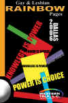
Gallery of Cover Designs
The purpose of a book
cover is to get your "attention" and to "sell" the
book. The more books people pickup, the more potential business
for your advertisers. A striking cover design will grab people's attention and people will want
to pick up the book and see what is inside. I would like to take the
Rainbow pages covers in a bold new direction. Please keep an OPEN mind and remember that we
WANT people to GRAB the
book.
The top five are the cover designs that I prefer.
cover design 11 - "BALANCED
ON THE EDGE OF DISCOVERY"
cover design 1 - "LOOKING
THROUGH THE RAINBOW"
cover design 7 -
"LETTERS"
cover design 10 - "RADIANT"
cover design
13 - "BLOCKS"
cover design
2, 3, & 6
The "Western Talk
advertisement" is meant to show placement of a cover advertisement
to be
determined.
The book title is as close as I can get to what is on the existing books
without knowing the exact fonts and/or having the image from you. I
would prefer to have the word "RAINBOW" in the title a solid color rather than
the multi-color text previously used because the covers are very
colorful and bold and I feel there will be too much competition.
